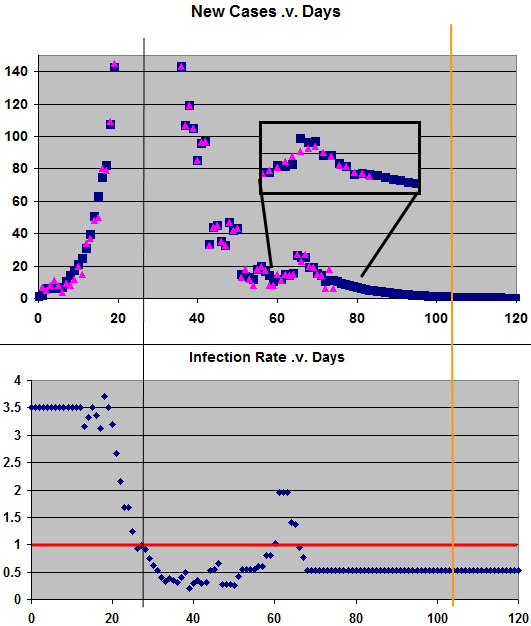
Hopefully my last update since Australia is doing really well and provided the politicians and we (the public) do not ‘drop the ball’ we are on the way out. The new case numbers are now becoming ‘noisy’ (which accounts for the large changes in infection rate) and can mostly be tracked to known causes. In the graphs below the vertical black line is our peak, the orange line is when new cases are less than 1 (11 June). However, we need to be vigilant until early July if we want to eradicate it locally. The insert shows new cases (pink) with a 5 day moving average. Blue is my model.